Holy Crepe is currently only a concept restaurant. It is a Parisian Cafe by name but serves food from all regions of France, even some common American foods with a French twist on them. On this page you will be able to learn about the branding and designing process for Holy Crepe.
Bon Appétit!
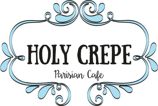
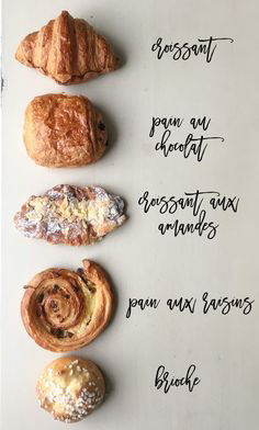
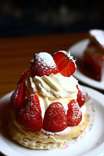
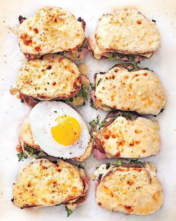
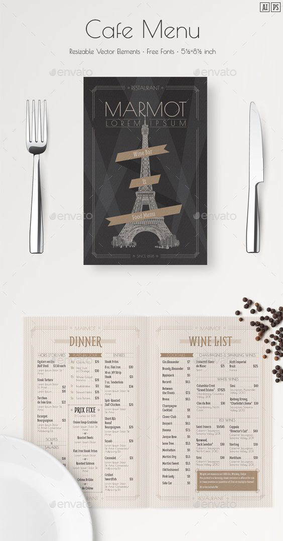
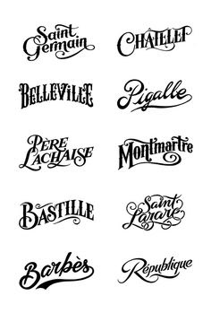
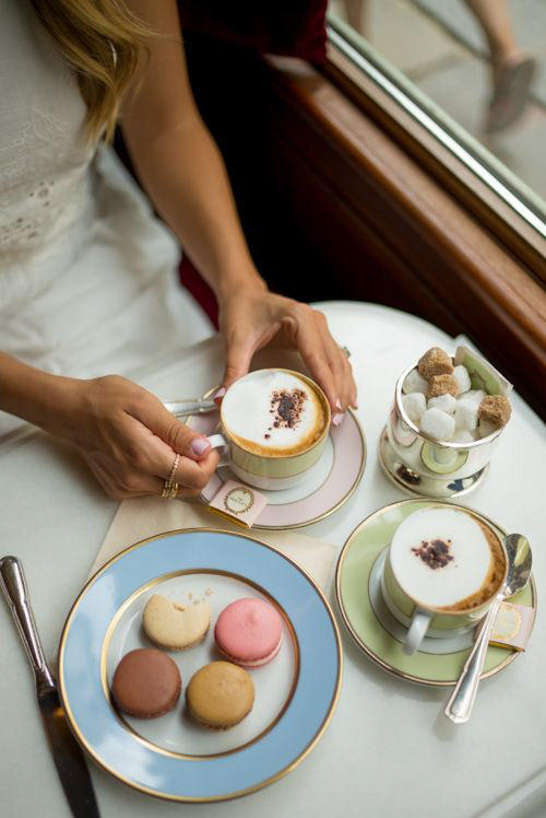
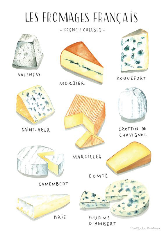
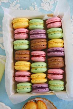
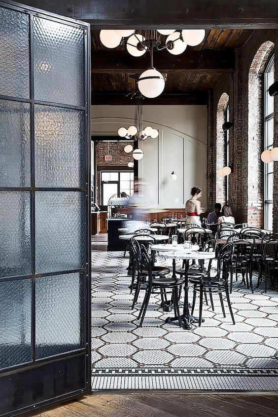
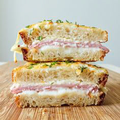
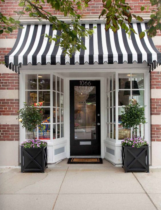
Image Collection
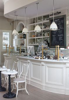
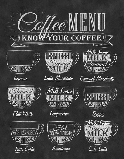
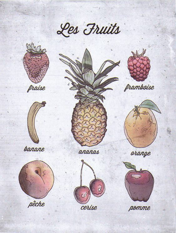
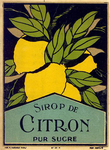
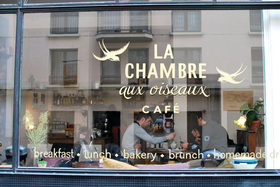
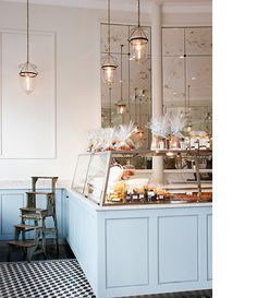
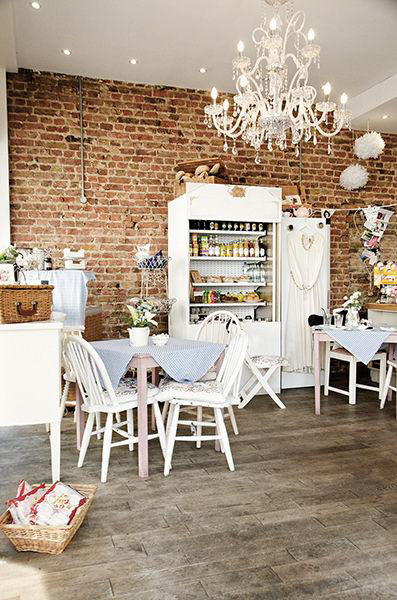
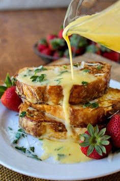
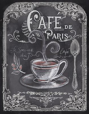
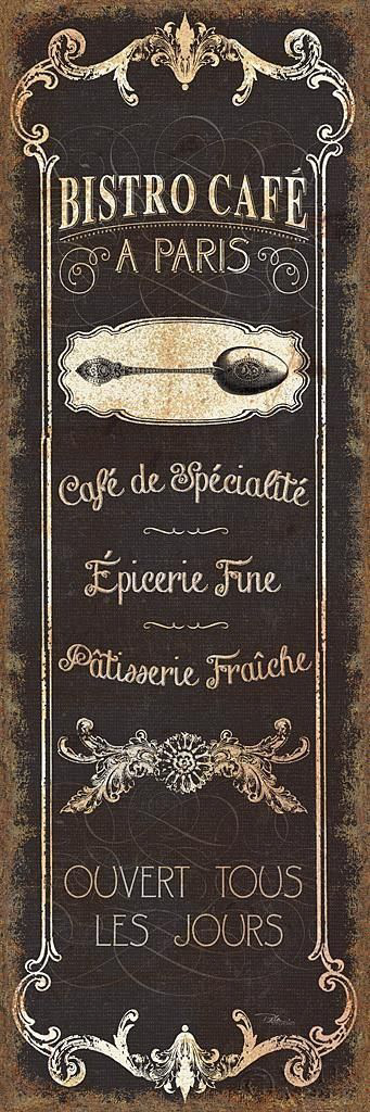
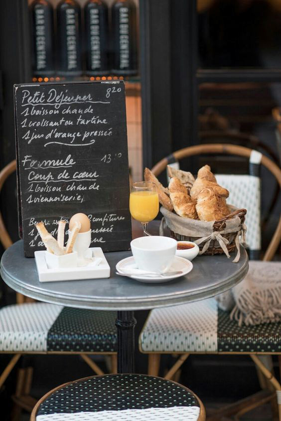
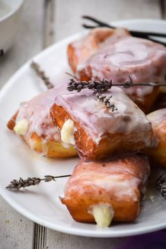
This image collection should give a good idea of what the inspiration and goal in designing Holy Crepe was. The goal was for the brand to have strong French aesthetics and be rich in French culture. French culture has a long and notable history in the arts and food and is fond of leisurely activities. These were the main ideas that helped to inspired Holy Crepe's image.

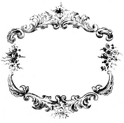


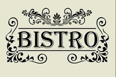


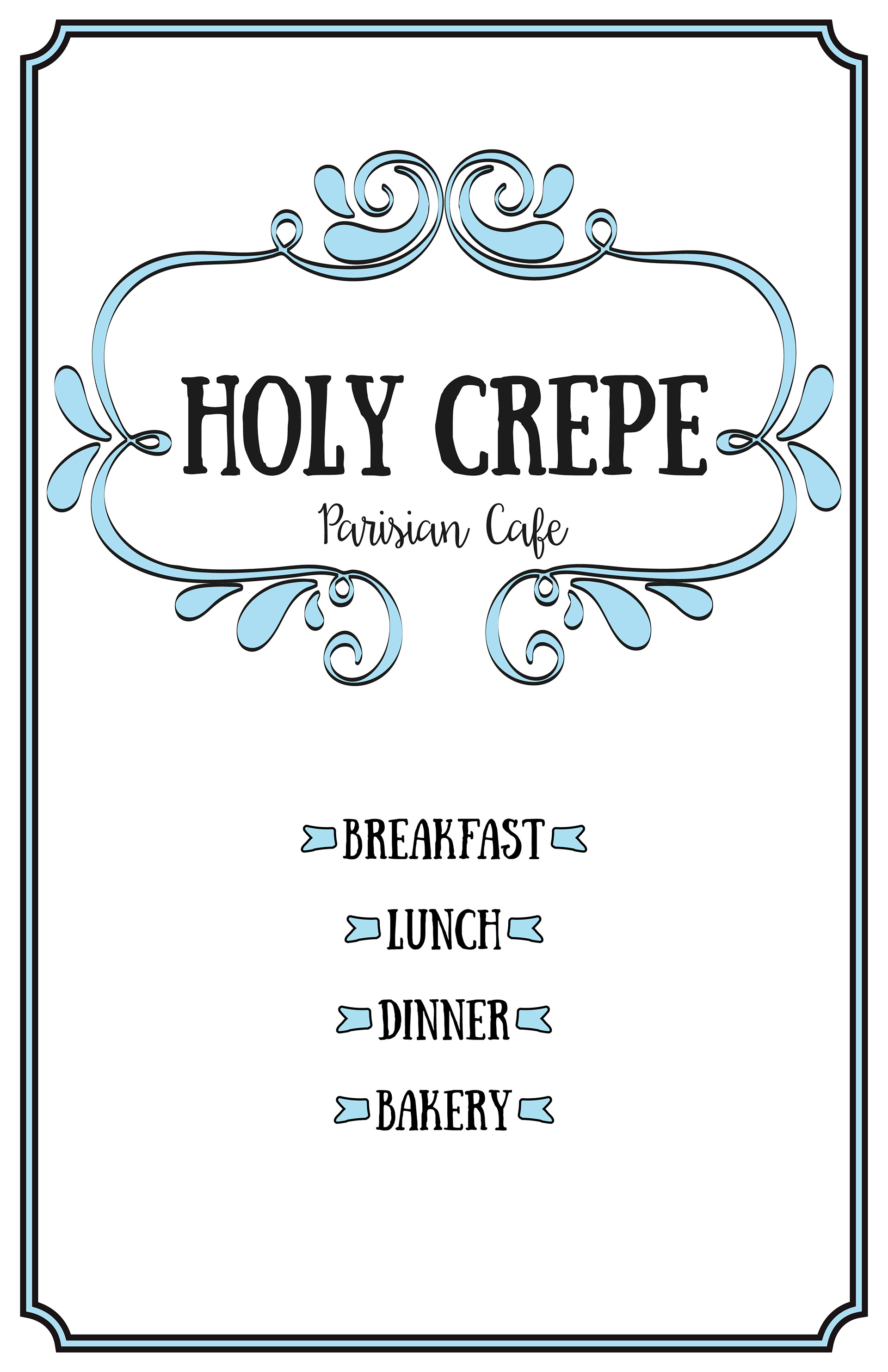
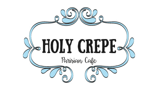
Logo

For the logo, font was very important. I wanted to choose fonts that were both classic and modern, like Paris. A vintage style seemed the easy way out for a French restaurant, so I wanted to take vintage elements and give them an updated look. I chose to use an ornamental frame for the text to give the logo a specific shape. I wanted the name Holy Crepe to be bold, so that it would not be overpowered by the frame, a serif font was the perfect choice. I also wanted to include a script font to give it an elegant and inviting feel. For the colors, I chose black and powder blue. I wanted to keep the colors as simple as possible.
Business Card

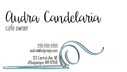
I think business cards should be simple, but not boring. I decided to use one side of my business card to place the logo since it is the single most important information for the brand. On the other side is where I have all of my contact information. I have my name in a different font than the rest of the text so that it stands out. I chose to incorporate a text ornament to help bring some of the branding elements to this side of the card and to also hold the contact information.
Flyer

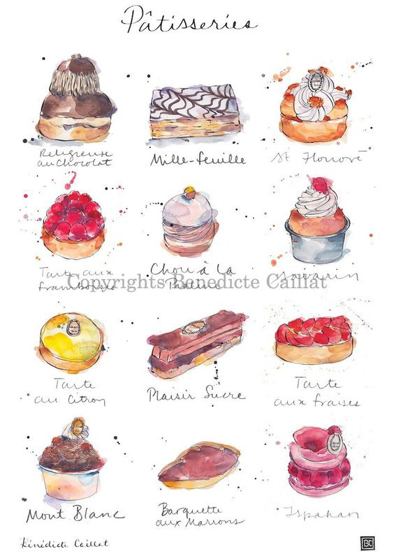
The flyer is meant to advertise the grand opening of Holy Crepe. I wanted the flyer to be more eye catching than the rest of the product designs, which are more simple. The flyer features several watercolor pastry illustrations in the background because there will be free pastries at the grand opening event. These also help bring an image to mind of what one will experience at Holy Crepe.
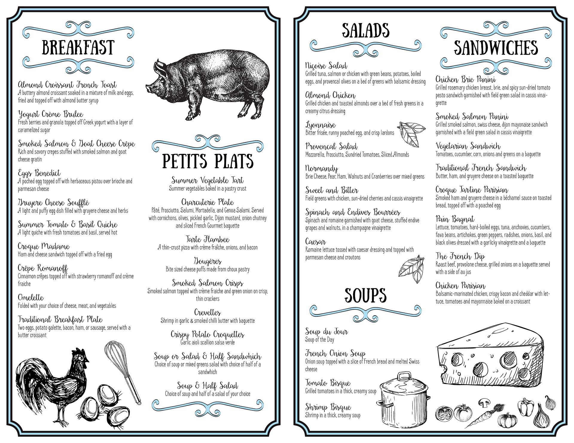
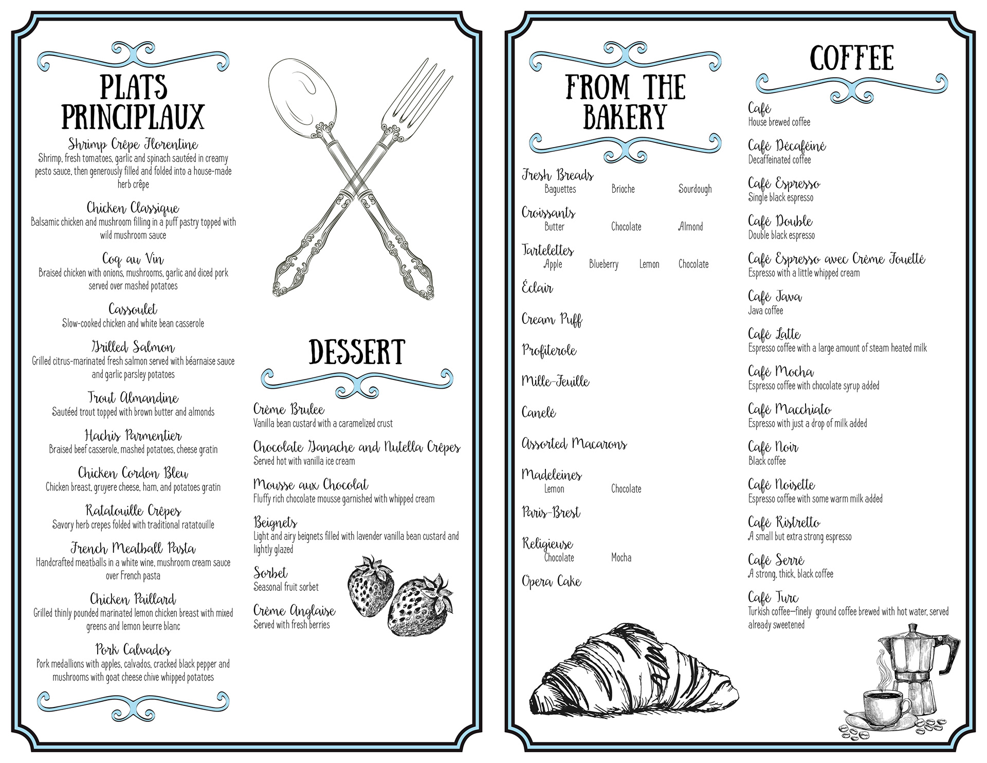
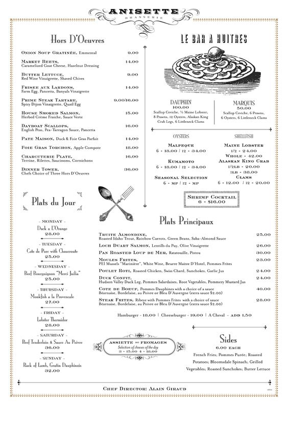
Menu
The menu design provides both the classic and modern look I am going for with the Holy Crepe brand. I chose illustrations of ingredients and cooking utensils that had a sketch-like style to give the menu a vintage feel.